Where Cultural Depth Lives in a Dating App
Usability Study for KRUSH, a Dating App for Global Asians


PROBLEM
KRUSH is a mobile dating app for global Asians, built around the Asian concept of yuán fèn (緣分), destined connection. As part of a team of three UX researchers at Pratt's Center for Digital Experiences, I helped run a moderated usability study of the live iOS app with six high-intent users with Asian backgrounds and/or anyone interested in, appreciative of, or passionate about Asian culture. We found that KRUSH's cultural promise was real, but the app's interface kept flattening it back into generic dating-app patterns.

My two contributions concentrated in two specific places:
A Competitive Audit of five culturally-focused dating apps (BLK, Lox Club, Muzz, Dil Mil, CaribbeanCupid) that framed the category-level gap KRUSH is working inside
End-to-end ownership of Recommendation 3 - the Global tab redesign, where six participants gave six inconsistent answers to "what is this for?"
The surfaced issues weren't only usability-related, but also turned out to be a positioning problem.
Our client gave the team a clear directive: explore how to better emphasize and capture “Asianness” within the product. That goal shaped every research question, task, and discussion while testing key user flows throughout the study.
While ambitious and broader than the scope of usability testing alone, we aimed to contribute insights around key usability issues that could help support this larger goal.
Design Question
Where in KRUSH's current experience does its cultural promise land and where does it fall back into generic dating-app patterns?
PROJECT GOALS
Helping a Culturally-Rooted Dating App Land its Promise More Fully

User starting the mobile testing task
A Team of Three, with One Recommendation Each to Own End-to-End
The team's three recommendations spanned three different parts of the app:
Recommendation 1
Bridge the Matching-to-Conversation Gap (owned by Amy)
Recommendation 2
Recommendation 3
This case study tells the story of the project but goes deepest on the two pieces I most closely worked on: the competitive audit and the Global recommendation.
TESTING
Every Task We Wrote Paired Usability with a Cultural Probe
Outside of our usability flows, every task was paired with a cultural probe: not just "can you set up your profile?" but "do these identity fields capture what you actually want to express?"

Moderated usability testing session in our UX lab
We landed on four task scenarios mapping the app's core flows:
Six High-Intent Users, Balanced Across East and South Asian Backgrounds
We screened against three criteria: ages 20–35, East/Southeast/South Asian heritage or strong self-reported cultural connection, and active use of at least one dating app. We recruited through Pratt's Private Panels system and supplemented via Instagram Threads, Reddit, and Pratt Network.

User testing: participants
All six were first-generation (born abroad and now in the U.S.) which matched KRUSH's primary user base. The sample weighted toward women (5 of 6), which we flagged as a limitation.
The East/South Asian split (3 and 3) turned out to be the most analytically useful dimension: South Asian participants surfaced gaps in cultural breadth that East Asian participants didn't.
SYNTHESIS
We Sorted Findings By Theme, Not By Feature, Which Let Two Separate "Bugs" Reveal One Underlying Problem

Affinity mapping after our user testing sessions
Sorting by theme rather than by feature let us see that 'Global tab confusion' and 'identity feels reductive' weren't isolated usability bugs: they were two faces of the same underlying problem.
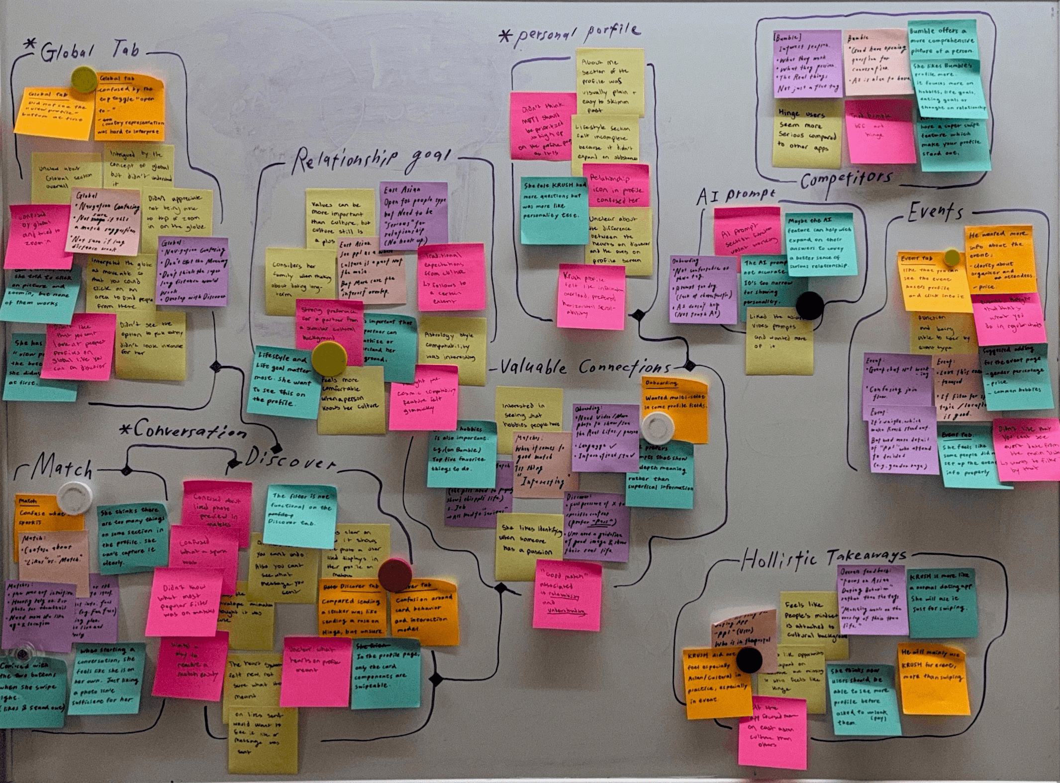
Final affinity map
Themes alone don't make recommendations. We had to filter them: which findings sat in the sweet spot between business goals and user needs, and which were one without the other?
We weighed by frequency (how many participants surfaced it) and severity (how much it blocked or distorted the experience). The three recommendations that made the final report were the ones that scored across all four dimensions.
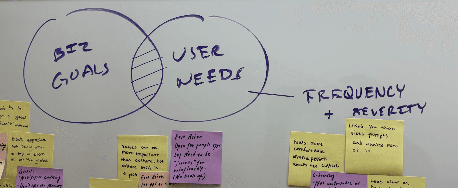
Mapping the sweet spot between business goals and user needs
Severity Heat Map
We synthesized severity into a heatmap across all six participants:

Note: Symbols accompany the color severity sections to support accessibility and avoid relying on color alone to communicate findings.
Overall Results
Across all six sessions, KRUSH's cultural foundation appeared in fragments rather than consistently. It was hinted at, but not fully reinforced. Culturally-specific prompts delighted users, but the surrounding interface didn't carry the same depth.
Three patterns dominated the findings: global tab confusion (universal), a gap between matching and conversation, and friction in profile setup.
COMPETITIVE AUDIT
Capturing Culture: Patterns Across Cultural Dating Apps
I audited five culturally-focused dating apps (BLK, Lox Club, Muzz, Dil Mil, CaribbeanCupid) to understand whether the issues we saw were KRUSH-specific or category-wide.


I triangulated insights from product walkthroughs, promotional content, App Store reviews, articles, and Reddit to understand both intended experience and real user perception. I looked for patterns, not feature equivalence, where these apps succeed, where they break down, and what that means for KRUSH’s opportunity space.
What these apps do well:
Strong cultural specificity through structured identity (multi-dimensional filters, not single tags)
Diaspora-aware design that supports cross-border matching
Community extensions beyond matching (events, chats, livestreams)
Clear intent signaling (e.g., marriage-focused or pre-filtered seriousness)
Where they fall short:
Cultural identity often collapses into stereotypes or labels
Experiences can skew toward dominant subgroups within a culture
Culture is expressed through static tags rather than lived behavior
How This Applies to KRUSH: Main Takeaway from the Competitive Audit
The category-level gap mirrored what we saw in testing: users don’t want culture as labels. They want it expressed through behavior, context, and interaction.
This reframed KRUSH’s opportunity: not to compete on more cultural fields or filters, but to evolve how culture is represented, beyond identity tags into lived experience within the product.
FINDINGS
Three Findings Rose to the Top, But Only One Was Universal Across Every Participant
Across all six sessions, three findings rose to the top in severity and in proximity to what KRUSH says it's trying to be:
The handoff from "like" to conversation has no scaffolding.
Users matched, opened the message screen, and stalled, staring at a blank text field with no contextual support.
(Amy turned this into Recommendation 1: contextual openers grounded in shared culture, post-match scaffolding, and a clear visual language for the heart/spark/like distinction.)
Identity labels and prompts read as flat.
Generation, ethnicity, and language tags felt indistinguishable from mainstream apps. The parts of the profile that delighted users were the culturally-specific prompts ("rice vs. noodles," "survive my family") -> but these were buried, and minimal.
(Mandy turned this into Recommendation 2: a relationship-values quiz, highlighted commonalities on profiles, and broader cultural identity options.)
Global was universally confusing.
Every single participant (6/6) struggled to articulate what the Global tab was for. They didn't agree on what it was, they just agreed they didn't know.
(I turned this into Recommendation 3, walked through in detail below.)
The full report covers all three recommendations end-to-end. The rest of this case study goes deepest on Recommendation 3, because it's the recommendation where I learned the most about the difference between a usability problem and a positioning problem.

RECOMMENDATION
“Global” Lacked a Shared Mental Model
Six participants gave six different, and conflicting, interpretations of what “Global” meant or what the feature exactly did. The core issue wasn’t a single usability breakdown, but that users built entirely different mental models of the feature.
Instead of converging on one understanding, participants interpreted “Global” as:
A way to see people in their city who come from elsewhere
A global matching system with unclear geographic logic
A separate recommendation layer within the app
A feature whose purpose overlaps with “Discovery,” making its role unclear
This led to uncertainty about both who users were seeing and why they were being shown them.

Current Global landing screen
"I felt like it was a 3D version of representing people living in the same city, but who are originally from other places. That's how I interpreted it." - P5
"Does this just randomly pick people from across the world and then you can talk to them? I don't know if this means that the person is from that country, or if they're actually based in the US and they just want to talk." - P2
"For discovery I think that's just like a standard dating app to show you the people. And then global because this is only like one person, so I assume it's inside the system recommending someone they think would be a good match." - P4
"Discovery is like Hinge in a way. Global is… I don't know what we're supposed to do with this." - P6
It Wasn't a Usability Problem. It Was a Positioning Problem.

Global results and profile display from both Discover & Global
Discover and Global were asking users to do the same thing in slightly different visual containers: both showed one profile at a time, both asked for a like or pass, and neither articulated why it existed alongside the other.
A second set of issues compounded the confusion. The interactive globe invited zoom and rotate gestures, but tapping pins didn't go anywhere. The "View Profile" CTA was easy to miss. And in a follow-up review, I caught a filter accuracy issue: a "Canada" filter returned a Netherlands-based profile in the next batch.
The root cause wasn't a failure of either tab individually. It was a missing answer to the question:
What does Global do that Discover doesn't?
Positioning Matrix
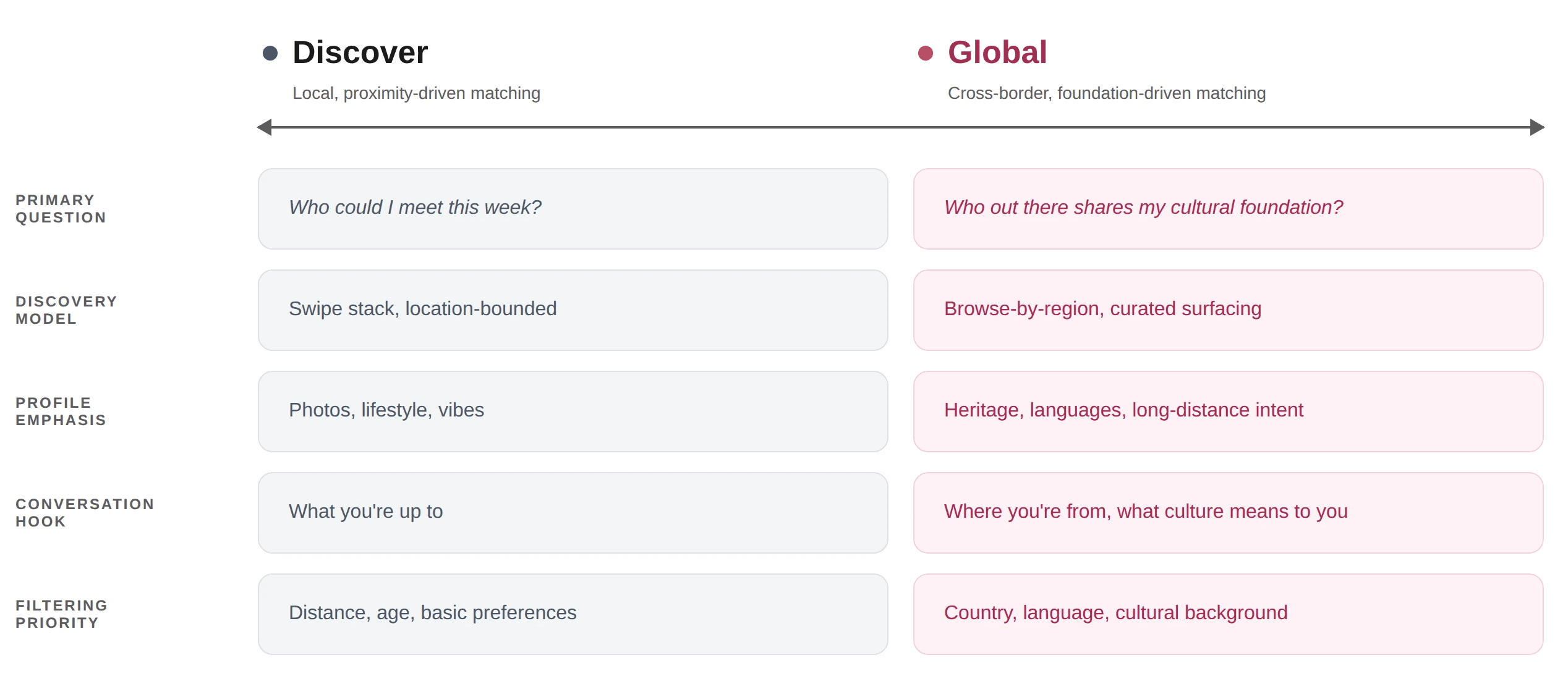
A positioning matrix that separated Discover and Global into two distinct discovery modes
This matrix became the test for every UI move that followed: if a design didn't make one of these distinctions clearer, it didn't belong.
FINAL DESIGNS
Four Chained Design Moves to Make the Differentiation Legible
Each one is paired with a Current → Recommendation comparison.
Participants couldn't articulate what Global was for, and the interface didn't help. They landed on a bare globe with no framing, no comparison, and a single floating profile to react to.
Global Positioning: The matrix said Global's primary question is "who out there shares my cultural foundation?" -> but the current screen answered nothing.

Global landing comparison
Make filtering trustworthy by making it visible, immediate, and accurate.
The most important filters for cross-border matching were buried, applied silently, and didn't always return what they promised, leaving users uncertain whether the system was working at all.
Global Positioning: The matrix said Global's filtering priority is country, language, and cultural background -> but the current screen buried those filters and applied them silently, leaving users uncertain whether they were working at all.

Filter-applied frame with the Canada × Japan × pills
Frame cultural foundation as conversation hooks, not as filter criteria.
Users wanted culture to show up as something to talk about, not something to sort by, but Global profiles still presented cultural-related content as a stack of identity tags rather than as openings for a real conversation.
Global Positioning: The matrix said Global's conversation hook can be "where you're from, what culture means to you" -> but the current profile presented that same content as a stack of identity tags, sortable but not openable.

Match's profile with Global call-out
Make the match remember where it came from.
In the current app, the Global tag disappears the moment a match becomes a conversation, exactly when context would be helpful. Knowing how the connection came to be would have given users something to open with.
Global Positioning: The matrix said Global's discovery model is cross-border and foundation-driven -> but the moment a Global match became a conversation, the interface dropped that context entirely, exactly when it would have been most useful.

Chat screen with Global badge on the avatar
What changes for the user:
A user entering KRUSH would be able to understand Global at a glance. Discover is for who's around me right now. Global can be for who shares my roots and/or values from anywhere in the world.
The cultural framework KRUSH's founders described (meeting people across the global Asian community, finding partners who share an unspoken cultural foundation) has a natural home in Global.
Today, it's the most confusing part of the app. Properly positioned, it could become the part that most clearly delivers on KRUSH's founding promise.
DELIVERY
Where the Recommendation Landed With KRUSH
We presented our findings to KRUSH's co-founder in May 2026. He listened to all three recommendations, asked sharp questions about Global especially, and then told us something we hadn't seen in the testing: they had usage data that lined up with what we'd surfaced.
Global users convert to paid at meaningfully higher rates than Discover-only users, but only 60% of Global users send likes, compared to 95% on Discover.
The data supported the reframe -> Global wasn't unwanted, it was not fully realized. Users were clearly drawn to what it promised, but the interface wasn't yet giving them a clear enough reason to act.

Our final presentation to KRUSH
"You guys did really nail some of the problems that we were actually thinking." - Stephen Moon, Co-Founder of KRUSH
The KRUSH team had independently flagged that the UX flow was hard to understand, and a Global redesign was already in motion when we presented.
Our recommendation gave that redesign more specific user evidence to build from.
WHAT THIS PROJECT TAUGHT ME
The Most Important Findings Went Beyond Interface Design
Some problems look like usability problems and aren't.
Six participants giving six different answers to "what is this for?" wasn't a labeling issue. It was a positioning gap that no amount of UI polish would have fixed.
Competitive audits earn their keep when they reframe scope, not when they list features.
The five-app audit didn't change our recommendations directly. It changed what we thought the recommendations were for.
Cultural probes belong inside usability tasks, not next to them.
Pairing every task with a cultural question surfaced the gap between what KRUSH said it was and what the interface delivered.
NEXT STEPS
What I'd Do Next
If I were continuing the project, three areas would shape the next round, with each one moving from the problem this study surfaced toward the evidence the next design needs.
Validate the redesigned recommendations with a follow-up moderated study.
Dedicate more time to develop cultural breadth beyond Global.
Learn from how current users already engage with culture in the app.
CLIENT FEEDBACK
From the Founder
“The Pratt Institute KRUSH project team demonstrated an exceptional ability to uncover meaningful insights through deep and thoughtful user interviews, while translating those findings into highly practical and actionable UX recommendations. Their work was not only strategically grounded, but also visually polished and aesthetically strong. Beyond the quality of the deliverables, the team showed outstanding communication skills, professionalism, and a genuine level of care throughout the collaboration.”
-Stephen Moon, Co-Founder of KRUSH
Project completed Spring 2026 as part of INFO 644-03 Usability Theory & Practice, Pratt Institute School of Information, in partnership with the Center for Digital Experiences and KRUSH.