Instagram-Ready Brand, Scattered Website
Forest Hills Stadium Redesign

OVERVIEW
While Forest Hills Stadium delivers a world-class venue experience, its website tells a different story. From confusing information architecture to text-heavy pages and accessibility issues, there’s an opportunity to improve the website’s usability and brand identity.

The Problem
For a venue that accommodates so many people physically, they should be able to do the same digitally.
Forest Hills Stadium has been a New York City landmark since 1923. It holds thousands of people, and offers accessible spaces and accommodations (e.g., accessible seating, sign language interpreters, and accessible restrooms). People from all backgrounds can come together here to experience concerts and community. But their website says otherwise.
Have you ever visited a website and thought: "This website feels old or outdated?"
When we first visited their website, it felt outdated and disconnected from Forest Hills Stadium's brand. In the venue's other digital presences, like social media, they portray a strong sense of community, prominent branding, and display visitor engagement through their profile. The venue experience feels more connected.
Designed with information scattered across pages, text-heavy pages, and no visual breathing room, Forest Hills Stadium's website feels less modern and engaging. But when I started digging deeper and audited the site for accessibility, I found the barriers weren't just visual.
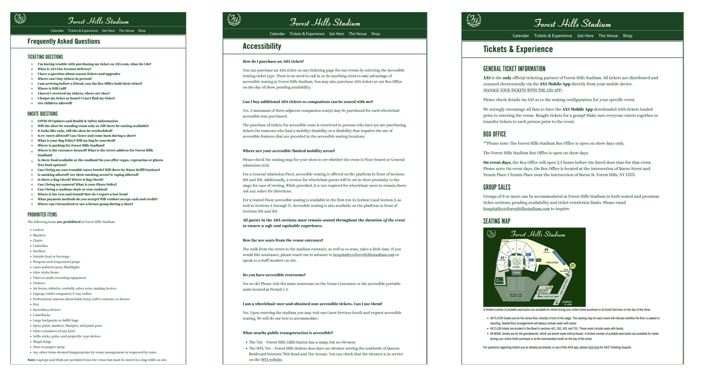
Original: Pages from Forest Hills Stadium’s Current Website
Digital Barriers Identified
If their website is inaccessible and difficult to navigate, barriers to accessing essential information are created, excluding potential audiences from cultural experiences and causing user frustration. It directly impacts Forest Hills Stadium's ability to serve the community.
Insufficient Contrast: Hover states lack contrast, making links difficult or impossible to see.
Keyboard Navigation Failure: Dropdowns receive focus but don't open, blocking keyboard-only users from subpages.
Missing Semantic Structure: Visual headings aren't coded as headings, preventing screen reader users from navigating the page structure.
Content Locked Behind Interactions: FAQs can't be opened without a mouse, hiding critical information from keyboard and screen reader users.
Poor Information Architecture: Important details are spread across dense pages, forcing users to hunt for content.
Accessibility Audit Results
To get a better picture of the overall accessibility, I conducted a small-scale accessibility audit. While remediating many of the issues was out of the scope of the project, identifying major accessibility failures helped inform the direction and priorities of the redesign.
Identified Accessibility Issue | WCAG Success Criterion (Level) |
|---|---|
Insufficient link color contrast on hover | WCAG 1.4.3 (Level AA), 1.4.11 (Level AA) |
Text fields styled to resemble buttons | WCAG 1.3.1 (Level A), 3.2.4 (Level AA) |
Focus visible failure (elements receive focus without a visual indicator) | WCAG 2.4.7 (Level AA) |
Linked images missing alternative text (e.g., header logos) | WCAG 1.1.1 (Level A), 2.4.4 (Level A) |
Low-quality or duplicate alternative text | WCAG 1.1.1 (Level A) |
Document language not defined in HTML | WCAG 3.1.1 (Level A) |
Text styled as headings without semantic markup | WCAG 1.3.1 (Level A), 2.4.1 (Level A), 2.4.6 (Level AA) |
Adjacent links pointing to the same destination | WCAG 2.4.4 (Level A) |
Missing H1 heading | WCAG 1.3.1 (Level A), 2.4.6 (Level AA) |
No "Skip to main content" mechanism | WCAG 2.4.1 (Level A) |
Navigation dropdowns inaccessible via keyboard | WCAG 2.1.1 (Level A) |
FAQ accordions cannot be opened using a keyboard | WCAG 2.1.1 (Level A), 2.4.3 (Level A) |
Accessibility As A Content Strategy
The website was actively preventing people from accessing information they needed to attend the venue easily and comfortably.
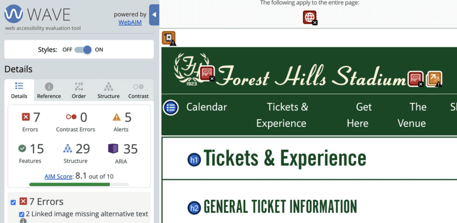
WebAIM WAVE Report
Accessibility isn't separate from content strategy. It is content strategy. What I realized from this audit is that these aren't separate accessibility problems; they're structural problems. The website wasn't organized for how people actually think about attending a concert. It was organized in whatever way made internal sense, without considering the diverse needs and mental models of the people trying to use it.
And that became the starting point for this project:
How do we design a website that actually serves visitors through usability and inclusive design?
Prioritizing Understanding Before Anything
To become subject matter experts, we took inventory of all sections of the Forest Hills Stadium website. I also researched the venue further to gain a deeper understanding of its historical relevance and more context before moving into the redesign.
We made a sitemap to visualize the site and created an organized content audit inventory in a sheet based on the original web pages. Because there was overlap between content items, we only included one instance of each content item. Using this list, we grouped some repetitive items into single instances of the content for clarity (e.g., 'Upcoming events carousel + Upcoming events cards' → 'Upcoming events'). We included broader themes of the content from the FAQ as cards in the hope of being able to redistribute the information, decentralizing it from just a catch-all FAQ section.
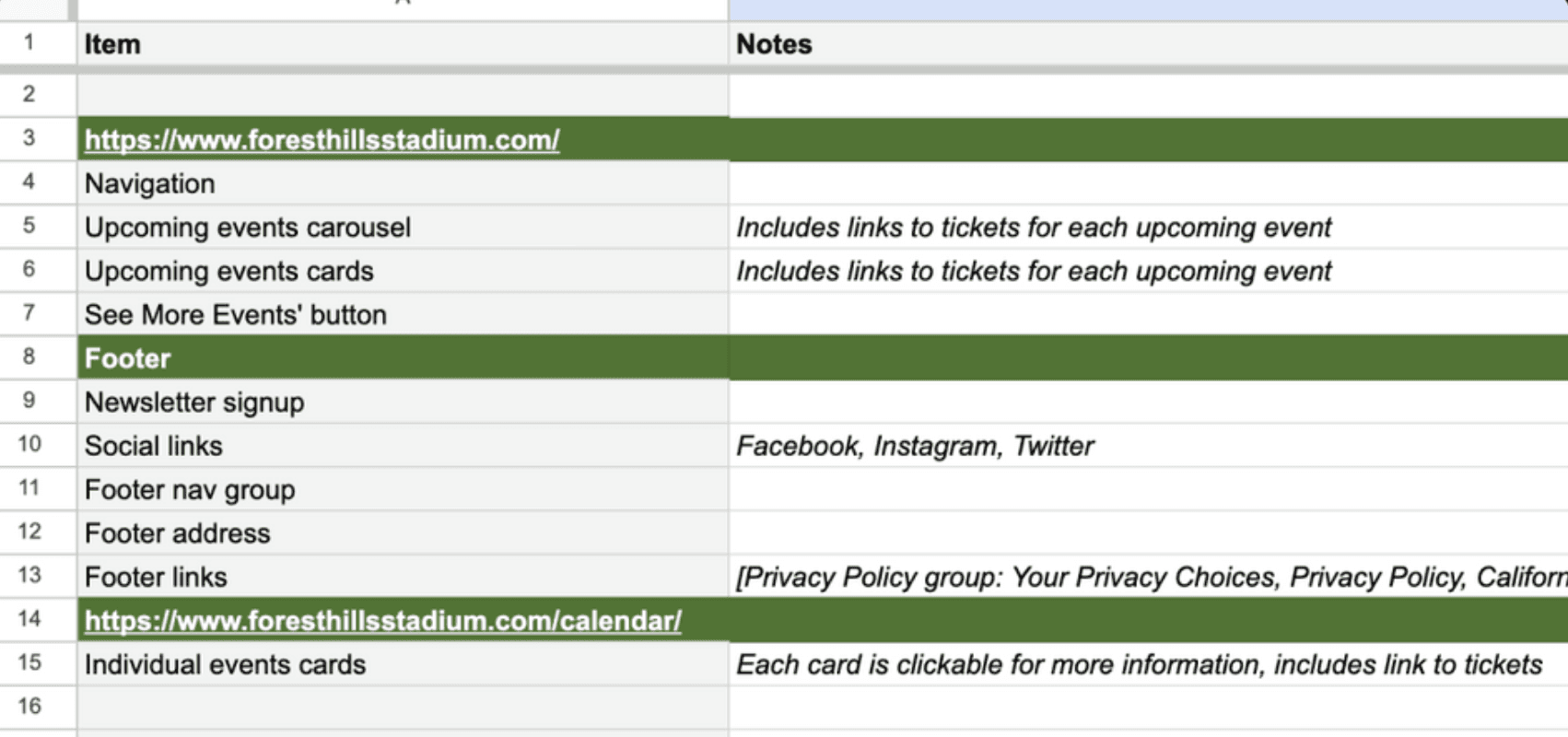
Content Inventory Sheet